Themes
Between our two sources of data, we were able to identify five common themes regarding struggles, strengths,
and desires pertaining to productivity.
-- The desire to have a productivity solution which mitigated struggles with time blindness and forgetfulness.
-- The desire to have a productivity solution that would not restrict use to just one approach, and instead,
provide flexibility with the way people utilize it.
-- The need for a productivity solution to be simple, intuitive, and not overwhelming.
-- The need for a productivity solution that did not require users to have strong executive functioning skills.
-- The need for a productivity solution that would take away the need to utilize multiple systems
Themes Translated into Specific Needs
From the themes we identified, we were able to encapsulate the essence of what each described into four main needs
and features our productivity dashboard had to address.
-- Everything should be in one place
-- Have the ability to keep track of the little details
-- Support users who struggle with time blindness
-- And finally, have a low barrier to entry
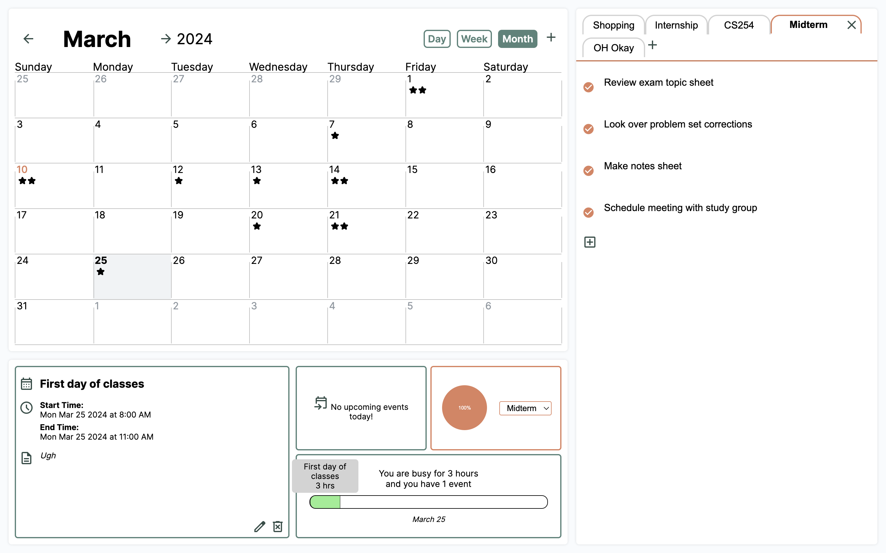
1: One View
After identifying the four issues we aim to address, we determined that to fulfill the need of keeping everything
in one place, basing our app around a single-view
interface would be the most effective solution within the scope of a web-based productivity dashboard.
One survey respondent stated that if they cannot see it, whether that be notes, calendar events, or features,
they forget it exists.
If a user loses track of relevant data, or forgets a feature exists, it is no longer beneficial to them.
With this understanding, we decided that our product had to exist as one view, where users wouldn't have to
hunt through menus and pages to find what they are looking for.
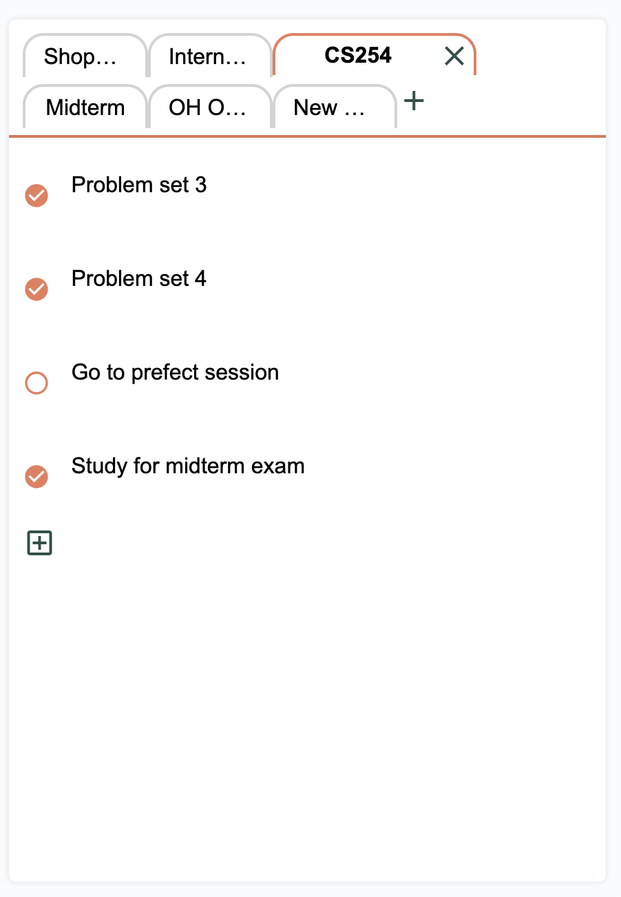
2: Quick and Simple Notetaking
To address the issue of supporting users in keeping track of the little details that arise in daily life, we
determined that integrating a quick and simple note-taking feature was a necessary component of our productivity
dashboard.
Commentary both in the literature we looked at, and from survey respondents, emphasized the need and desire
keep track of random thoughts, events, and to-dos that people often otherwise would forget.
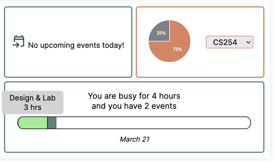
3: Time Visualization
With respect to supporting users who struggle with time blindness, we wanted our productivity dashboard to
accomplish this through some form of time visualization.
We came to this conclusion because we knew that addressing time blindness would pose an interesting
challenge, as it requires addressing something intangible in order to provide useful meaning for the user, so that
they would be able to better understand the passage of time.
Based on the overwhelming preference for having access to visualized information and data, we knew that we would
have to pay special attention to developing helpful ways to visualize time in order to address struggles with time
blindness.
4: Onboarding
Our fourth and final identified issue was how to make the barrier to entry very low. We decided that focusing on
accomplishing this by thinking about how the on boarding process for the user would function, would be the best
course of action.
We felt like this was a vital component to making our productivity dashboard accessible to neurodivergent people
because many respondents spoke about feeling overwhelmed by the process of learning a new tool, or by the sheer amount
of features they could use. One person specifically suggested that having the option to fill out so many details made
her feel obliged to do so. In addition, we wanted to ensure that in order to successfully use our product, the user
would not need to have strong executive functioning skills.
Thus, we needed to make the UI super intuitive and simple, and ensure that the smallest possible amount of effort was
required to use a feature.