Shapley and MOOC
This section discusses the application of the shap package to the Multi-Layer Perceptron that we built for the MOOC dataset. For image data, please refer to Shapley and ResNet.
The Code
We calculate Shapley values for our dataset via Python's shap package, a library of functions and classes which encompasses virtually all possible variations upon Lloyd Shapley's original analysis.
Due to its massive popularity, this package was quite convenient, requiring only a few lines to set up. First, we build our model (see more about our model here) and create an Explainer object for it.
import shap
# Create our ML model:
model = MultiLayerPerceptron()
# Create our explainer:
explainer = shap.explainers.Permutation(
  model.predict_proba,
  X_train,
  feature_names=feature_names)
This is a Permutation explainer, which builds all possible permutations of feature-value coalitions for the approximation of each Shapley value. The creation of such coalitions mirrors the base technique as outlined in the Shapley's Math page.
We use our model's predict_proba function to return real-valued probabilities for the classes "Course Completed" and "Dropped Out," and we pass in our training data X_train as our data matrix from which our explainer will pull substitute feature values in order to simulate each feature "not participating" in the game of predicton (See our explanation of features "not playing" in Shapley's Math).
Next, we run our explainer on the datapoints that we want locally explained:
# Generate Shapley values
shapley_values = explainer(inputs)
# Isolate the Shapley values by positive and negative probabilities
positive_shap_vals = shapley_values[..., 1]
negative_shap_vals = shapley_values[..., 0]
This returns the Shapley values for each datapoint in the set of inputs, as well as some useful information such as the expected (average) prediction over the set and some useful properties for Interpretable AI, which we will briefly cover at the end.
Explaining a single datapoint
Once we have our explanations, we can visualize the Shapley values for each datapoint. The shap package contains a plethora of visualization tools for intepretable AI, but for the purposes of our user study and for comparison with LIME and Anchoring techniques, we used the most popular visualization for a single datapoint: the waterfall plot.
# Generate a waterfall visualization
shap.plots.waterfall(positive_shap_vals[i])
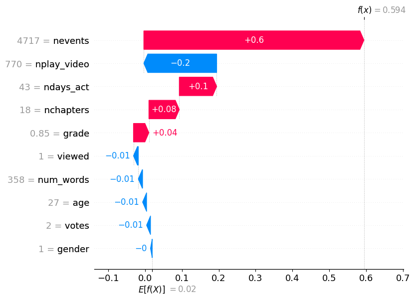
This returns a plot of Shapley values for the -th datapoint in the set, like so:

This is a visualization of the Shapley values for a positive prediction, where the probability that the person completed the course is over ( in this case).
Our visualization begins at the bottom of the graph with the average, or expected, prediction . In this case, the model is confident that the student will complete the course (). From here, we build upwards with respect to the relative size of the contribution to the prediction's deviation from the average: the values for the features gender through viewed each subtract from the average, while feature values from grade through ndays_act add between and to the probability (for more information on MOOC's feature values, visit our Methodology).
Finally, we see that the values for nplay_video and nevents are the biggest players in the game of prediction, deviating our result from the average probability prediction by and , respectively.
With these features combined, our model's prediction deviates from the average by , yielding .
Interpretation across a larger dataset
One of the advantages that Shapley values have over LIME is its relative ability to globally interpret a machine learning model's input set. While this loosely adheres to Shapley values' additivity principle, it is less strongly applicable when we are no longer dealing with individual players, as it enters into the domain of Cohort Explanation (Dhinakaran, 2021).
The simplest way to generate such an interpretation is to generate a bar graph of the average absolute Shapley values:
shap.plots.bar(shapley_values, show=False)
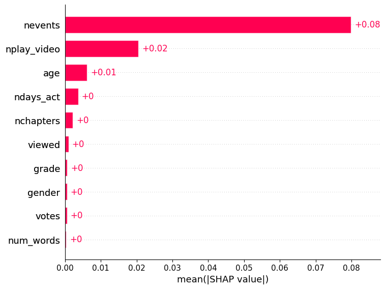
The following example is an interpretation of the model using the MOOC dataset's test data:

As we can see, nevents and nplay_video are still our biggest actors in a global setting, changing the prediction by and , respectively.
Something most peculiar about this is that unlike our explanation of a single positive prediction, our interpretive Shapley values are much smaller globally. What the values highlight here is a strong bias towards either course completion or dropout, as a small average deviation from prediction overall must mean that the data is skewed towards one prediction. In this case, a quick examination of the data shows that in our training data, only of all students pass. As such, the model is likely achieving a high accuracy through extreme negative bias, which is why there is such low deviation from the expected prediction on average.