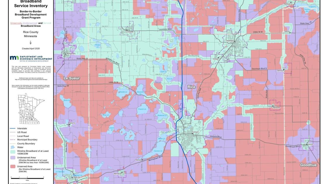
Mapping internet coverage is a powerful way to gain a better understanding of who needs the most access where. However, most of the coverage maps available for the area either a) don't have data granular enough to be useful or b) don't recognize that while an ISP may offer coverage in the area, a family may not have adequate access for another reason. These reasons could include a lack of affordable internet plan options, living in an apartment building with a landlord who has chosen a different ISP or speeds that don't actually meet those advertised by ISP's.
Although we know for a fact that there are roughly 200 families in the Northfield School District alone who don't have adequate coverage, due to the way internet speed data is collected and reported, the greater Northfield area is shown as having broadband speeds of 'at least 100M/20M'. Not only is this innacurate from an infrastructure-perspective, but also this data doesn't take into account financial or other logistical barriers to access.
We were unable to display our maps due to
restrictions from our community parters.
In order to get a more realistic sense of internet access for families we decided to map the data HCI collected from phone surveys with families.
There were three questions from the survey we ultimately used to build our maps. The first question asked 'does your student have access to a device that can connect to the internet?'. The second question we used was 'can your student stream without interruption?' and the last related to whether or not the family had requested a hotspot. In addition, we had each student's name, address and family ID. Because we can only assign one value to an address using arcGIS, if siblings were both listed on the phone survey, we cross-referenced the family ID and then chose a singular representative student for that family.
Although high-speed is defined by the Federal
Commission for Communication (FCC) as 25 Mbps
download/3 Mbps upload, there are a number of other
factors that can affect internet speed, including
the number of users online. As a result, a student
would only be listed as having 'adequate' internet
access if they both had access to a device that can
connect to the internet and could also consistently
stream without interruption. For example, if a
student was able to connect to their class
successfully but then experienced connection
difficulties when a sibling joined their own class,
this connection would not meet the standards of
'adequate'.
The other classifications for connection were
'Somewhat adequate' and 'inadequate'. These
classifications were sometimes a judgement call,
however we felt it was important to differentiate
between 'adequate', 'somewhat adequate' and
'inadequate'. As HCI continues to have to triage
their support, it's crucial they know where to
direct immediate and subsequent attention and
resources.
To maintain students' privacy but also share our visualizations
with Carleton and other community partners, with the
help of the GIS Lab we created density rasters.The
two rasters we created are for hotspot distribution
and students with either inadequate or somewhat
adequate internet access. For both maps, the cell
value is in hotspot (or students w [ ] access) per
square mile. However, this value is extended to the
area 2 miles in each direction from a point. For
example, if there is a single student with a hotspot
in a 6 square mile area, the map would display a
single 2 mile by 2 mile square, centered on the
student’s residence. The color of the square would
be the shade corresponding to 0.25/sq. Mile, because
in that instance there is 1 hotspot distributed over
a four square mile area.
Each raster also includes an expansion in the lower right hand
corner. For these plots, the density is halved (so
hotspot/half square mile) as is the extension value
(so 1 square mile squares instead of four square
miles). Although the rasters are less precise, they
are useful in not only highlighting clusters but
also when thinking about potential fixed wireless
tower locations, they demonstrate potential sites
that are centrally located with respect to many
families that need support.
Hotspot distribution density of the 96 hotspots HCI has
distributed to families in the Northfield School district.
- Although these are only students enrolled in Northfield
Public Schools, spatially HCI is providing support to students
throughout Rice County as well as a handful of students in
Dakota County
- Looking at the expansion in the lower righthand corner, we
can see that there are two especially dense clusters, one slightly
north of Carleton and one slightly to the south. The northern
cluster includes the area around Florella's and Viking Terrace
Mobile Home parks. The southern cluster is around the series of
apartment buildings on Jefferson Parkway, near the Community Action
Center.
Density of students reporting
inadequate or somewhat adequate internet connections in the Northfield
School district.
- It's key to note that while there are fewer students
displayed on this map than the hotspot map above, that is
because there are fewer families
who responded to those questions of the survey and not because
there are fewer families who have a less than adequate connection.
- Again, looking at the expansion we see these same clusters
around Viking Terrace and the apartments on Jefferson Parkway.
Based on these maps we were able to conclude that our
recommendations needed to adress the challenges that occur in rural
areas as well as the specific challenges that arise when increasing
access in mobile home parks and apartment buildings. Furthermore, one of our recommended long-term solutions was the
implementation of fixed wireless infrastructure.[LINK HERE]
These maps help identify potential tower locations that are
centrally located with respect to a large number of students who
would benefit from a stronger connection. The lower circle on the
map below is the theoretical coverage area of a fixed wireless
currently underway, and the upper circle represents a potential
tower site should HCI choose to pursue fixed wireless as a solution.